
统计遗传学研究中经常会需要通过GWAS的sumstats来计算遗传相关,并以一下这种简单易懂的相关矩阵形式展示,本文就以两篇高质量文章为例,来介绍遗传相关矩阵的绘图方法。
回顾:GWASLab:通过Bivariate LD Score regression估计遗传相关性 genetic correlation
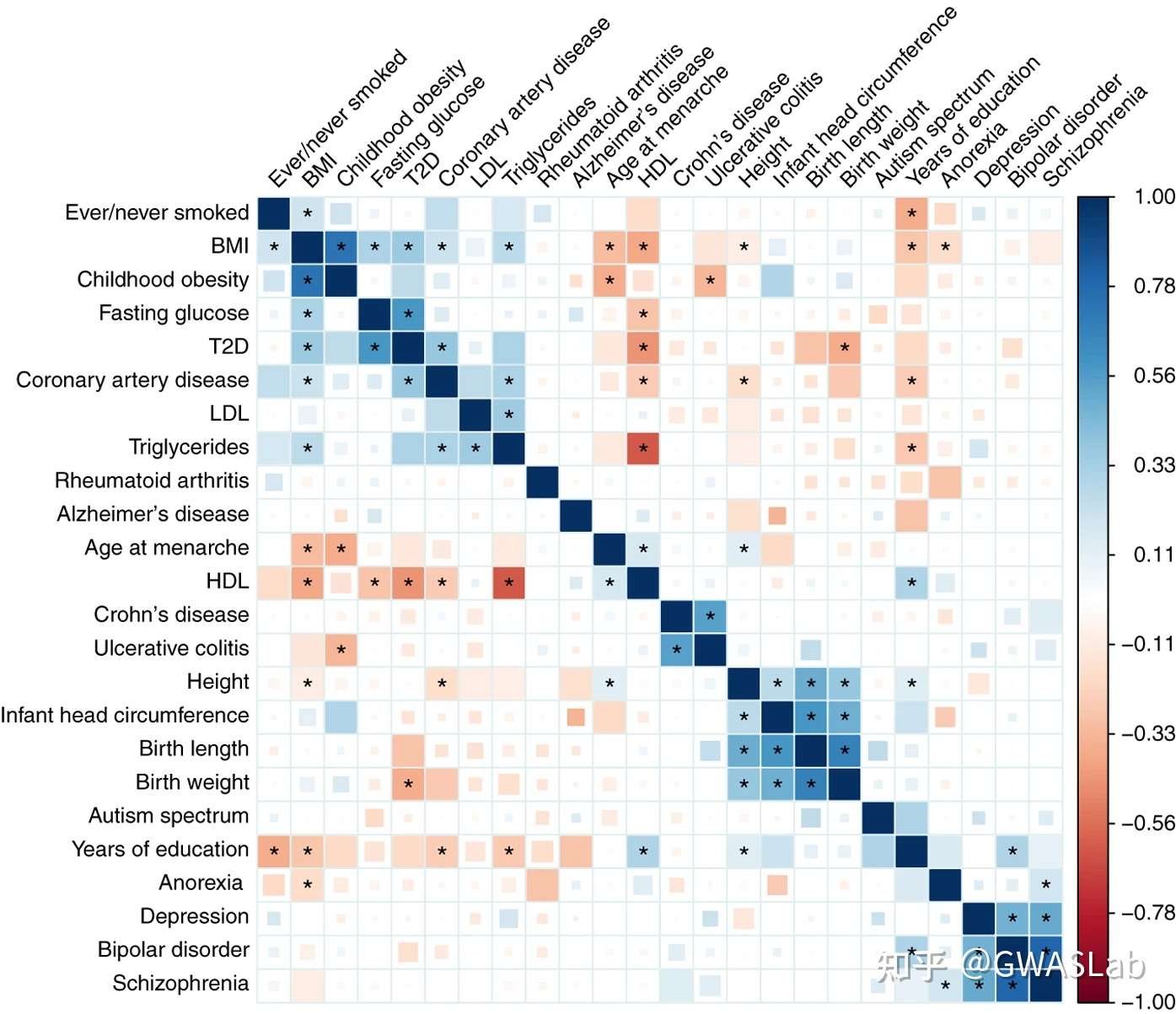
上图为An atlas of genetic correlations across human diseases and traits(文章链接:https://www.nature.com/articles/ng.3406)中的遗传相关矩阵的图,可以看到图中蓝色方块表示正向相关,红色方块表示负向相关,其中相关显著的表型(经过多重检验调整后)之间还会被 * 标记。这幅图中,方块的大小与颜色均表示相关系数,但这幅图还有个特别之处是FDR<0.01的方块被填满。(注意,这里的方块大小依然是相关系数,但近来的文章中,方块大小通常会被用来表示p值的大小,后续会介绍)
接下来我们尝试复现这幅图:
源数据格式如下:
$ head 41588_2015_BFng3406_MOESM37_ESM.csv
Trait1,Trait2,rg,se,z,p
ADHD,Age at Menarche,-0.153,0.08218,-1.858,0.063
ADHD,Age at Smoking,-0.036,0.2427,-0.147,0.883
ADHD,Alzheimer's,-0.055,0.2191,-0.249,0.803
ADHD,Anorexia,0.192,0.1162,1.649,0.099
ADHD,Autism Spectrum,-0.164,0.1438,-1.144,0.253
ADHD,BMI,0.287,0.08913,3.222,0.001
ADHD,BMI 2010,0.258,0.08606,2.993,0.003
ADHD,Bipolar,0.265,0.1539,1.722,0.085
ADHD,Birth Length,-0.055,0.1679,-0.329,0.742
使用R的官方corrplot来绘制,示例代码如下:
install.packages("corrplot")
library(corrplot)
#读取数据
ldsc = read.csv(file = '41588_2015_BFng3406_MOESM37_ESM.csv',header=TRUE)

#提取需要画的表型
to_plot_col<-c('Age at Menarche','Alzheimer\'s','Anorexia','Autism Spectrum','BMI','Bipolar','Birth Length','Birth Weight','Childhood Obesity','Coronary Artery Disease','Crohn\'s Disease','Depression','Ever/Never Smoked','Fasting Glucose','HDL','Height','Infant Head Circumference','LDL','Rheumatoid Arthritis','Schizophrenia','T2D','Triglycerides','Ulcerative Colitis','Years of Education')

#构建一个rg矩阵,和一个p值矩阵,并命名row和col
gcm_rg<-matrix(1, nrow = length(to_plot_col), ncol = length(to_plot_col))
gcm_p<-matrix(1, nrow = length(to_plot_col), ncol = length(to_plot_col))
rownames(gcm_rg) <- to_plot_col
colnames(gcm_rg) <- to_plot_col
rownames(gcm_p) <-to_plot_col
colnames(gcm_p) <- to_plot_col

#将数据填进矩阵
for (row in 1:nrow(ldsc)) {
    if(ldsc[row, "Trait1"]%in%to_plot_col && ldsc[row, "Trait2"]%in%to_plot_col){
    Trait1 <- ldsc[row, "Trait1"]
    Trait2  <- ldsc[row, "Trait2"]
    gcm_rg[Trait1,Trait2]<-ldsc[row, "rg"]
    gcm_p[Trait1,Trait2]<-p<-ldsc[row, "p"]
    gcm_rg[Trait2,Trait1]<-ldsc[row, "rg"]
    gcm_p[Trait2,Trait1]<-p<-ldsc[row, "p"]
    }
    }

#使用corrplot绘图:(方法选择square)
#sig.level = 0.05/300 为显著水平(这里是多重检验调整的)
#gcm_rg为相关系数矩阵
#gcm_p为p值矩阵
#order="hclust" 为通过分层聚类对矩阵进行排序
#其他选项均为细节调整 可以参考 https://cran.r-project.org/web/packages/corrplot/vignettes/corrplot-intro.html

corrplot(gcm_rg, p.mat=gcm_p, method="square",order="hclust",sig = "pch",sig.level = 0.05/300 ,pch="*",pch.cex=2,
         tl.col="black",tl.srt=45,addgrid.col="grey90")
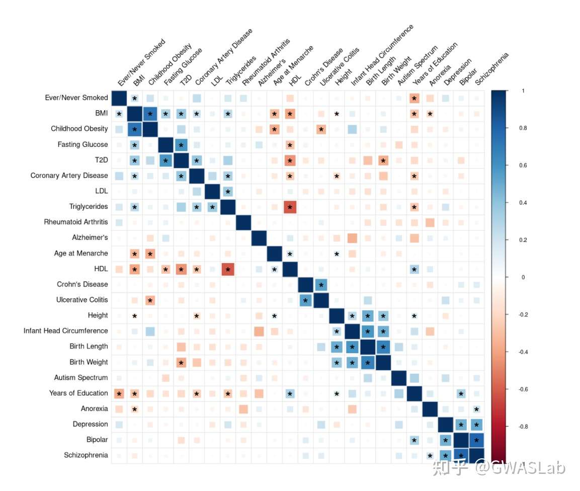
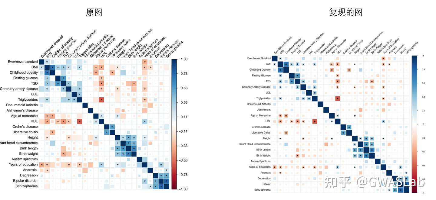
对比与原图,已经接近90%的相似度了,不同之处在于这幅图还有个特别之处是FDR<0.01的方块被填满。这需要对底层代码进行修改。
这里我们就略过此步骤,因为目前主流方法是,方块大小应该表示p值大小, 以提高遗传相关矩阵的信息含量,而不是途中混合的表示方式。方块大小表示p值大小的示例,如下图所示:
(文章链接:https://www.nature.com/articles/s41588-018-0047-6)
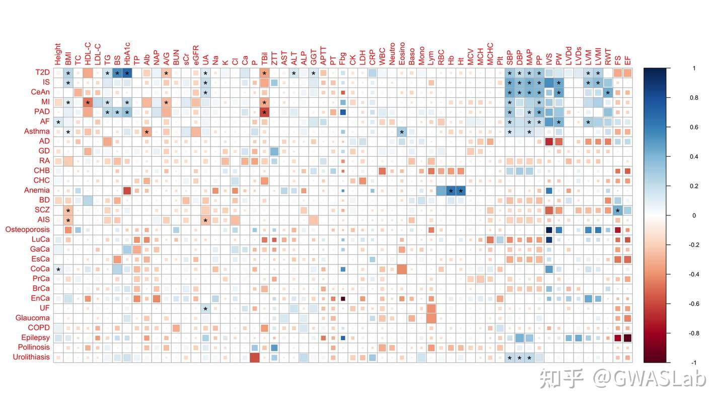
这张图中颜色表示相关系数,方块大小表示p值(fdr调整后)
这篇文章的作者提供了修改后的代码,可以通过github在R中安装修改后的corrplot:
github: https://github.com/mkanai/ldsc-corrplot-rg
install.packages("dplyr")
devtools::install_github("mkanai/corrplot")
安装后重新绘制:
#读取数据
ldsc = read.csv(file = '41588_2015_BFng3406_MOESM37_ESM.csv',header=TRUE)

#计算FDR调整后p值
ldsc$fdr<-p.adjust(ldsc$p, method ="fdr")

to_plot_col<-c('Age at Menarche','Alzheimer\'s','Anorexia','Autism Spectrum','BMI','Bipolar','Birth Length','Birth Weight','Childhood Obesity','Coronary Artery Disease','Crohn\'s Disease','Depression','Ever/Never Smoked','Fasting Glucose','HDL','Height','Infant Head Circumference','LDL','Rheumatoid Arthritis','Schizophrenia','T2D','Triglycerides','Ulcerative Colitis','Years of Education')

gcm_rg<-matrix(NA, nrow = length(to_plot_col), ncol = length(to_plot_col))
gcm_p<-matrix(NA, nrow = length(to_plot_col), ncol = length(to_plot_col))
rownames(gcm_rg) <- to_plot_col
colnames(gcm_rg) <- to_plot_col
rownames(gcm_p) <-to_plot_col
colnames(gcm_p) <- to_plot_col

#p值矩阵改为fdr矩阵
for (row in 1:nrow(ldsc)) {
    if(ldsc[row, "Trait1"]%in%to_plot_col && ldsc[row, "Trait2"]%in%to_plot_col){
    Trait1 <- ldsc[row, "Trait1"]
    Trait2  <- ldsc[row, "Trait2"]
    gcm_rg[Trait1,Trait2]<-ldsc[row, "rg"]
    gcm_p[Trait1,Trait2]<-ldsc[row, "fdr"]
    gcm_rg[Trait2,Trait1]<-ldsc[row, "rg"]
    gcm_p[Trait2,Trait1]<-ldsc[row, "fdr"]
    }
    }

#事先对矩阵进行排序(此修改的版本直接使用order="hclust"时有bug)
gcm_rg.hclust<-corrMatOrder(gcm_rg,order ="hclust")
gcm_rg_hclust<-gcm_rg[gcm_rg.hclust,gcm_rg.hclust]
gcm_p_hclust<-gcm_p[gcm_rg.hclust,gcm_rg.hclust]

options(repr.plot.width=15, repr.plot.height=15)
#使用修改后的corrplot绘图:(注意!!方法选择 psquare)
corrplot(gcm_rg_hclust ,p.mat=gcm_p_hclust, diag=FALSE,method="psquare",sig="pch",insig="label_sig",sig.level = 0.01 ,pch.cex=2,tl.col="black",tl.srt=45,addgrid.col="grey90")
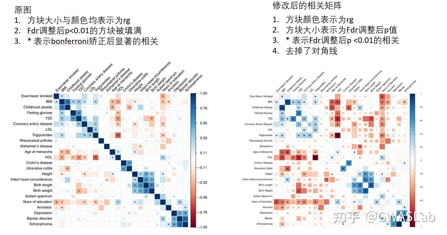
修改后的图图例更为统一,对于p值大小的表现更为清楚。
对于图中的排序方法,字体大小,旋转,颜色, 色调,colorbar等等细节可以参考 https://cran.r-project.org/web/packages/corrplot/vignettes/corrplot-intro.html 进行调整。
参考:
https://www.nature.com/articles/ng.3406#MOESM37
https://www.rdocumentation.org/packages/corrplot/versions/0.92/topics/corrplot
https://cran.r-project.org/web/packages/corrplot/vignettes/corrplot-intro.html
