之前介绍过曼哈顿图与QQ图的画法,但自己画终究还是有点麻烦,有很多数据的时候就很头疼,于是自己写了一个非常简单的python package,一行代码画好对齐的Manhattan plot 与 QQ plot,并基于一个给定的滑动窗口自动检测top SNP并注释。
Package: gwaslab
安装方法: pip install gwaslab
使用方法:myplot = gl.mqqplot(insumstats,"CHR","POS","PVALUE")
当前版本:0.0.5
依赖的包:scipy,numpy,matplotlib,pandas,seaborn
(注意:非专业开发人员,完全用爱发电,自用的scripts改成的包,难免有bug,欢迎在github上指正,或提意见或建议, https://github.com/Cloufield/gwaslab )
使用示例:
实例数据下载: http://jenger.riken.jp/result
ID 1 Atrial Fibrillation
读入数据
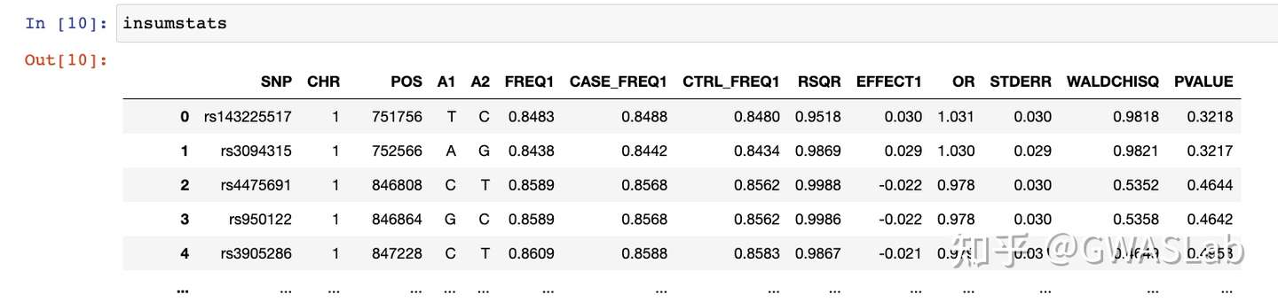
输入文件是一般的gwas sumstats就可以,有chr,pos,pvalue三列就可以画:
import pandas as pd
import gwaslab as gl

#读取输入文件
insumstats = pd.read_csv("AF_1000G_rsq09_FINAL.txt.gz","\\s+")
本次使用的示例数据如下
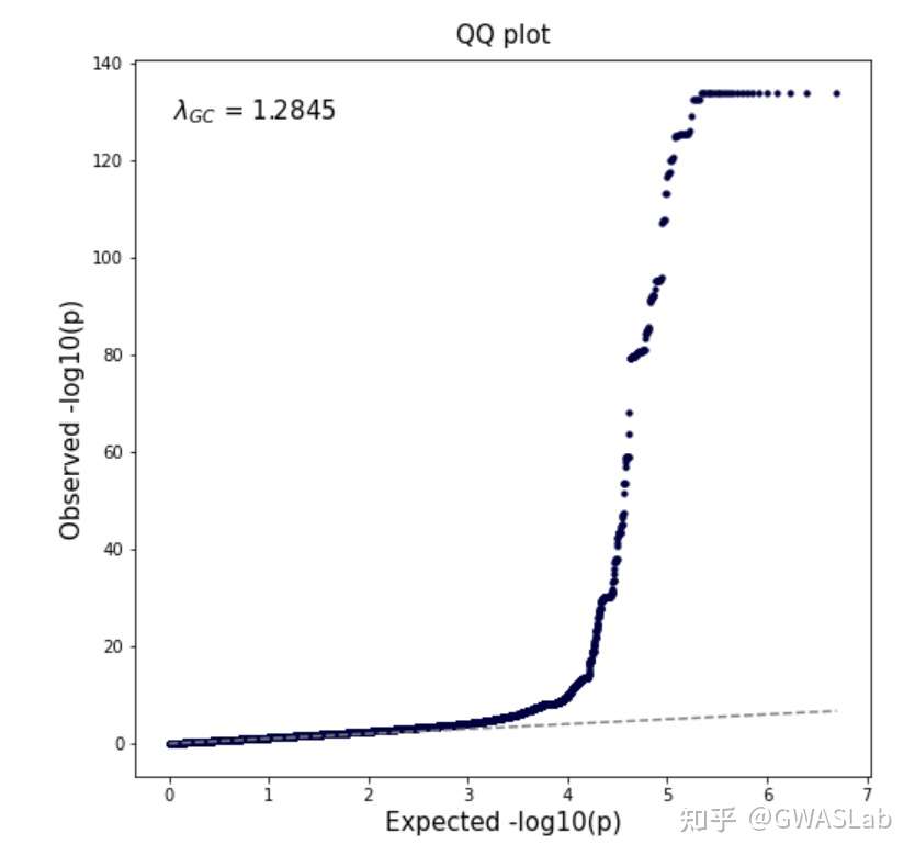
使用mqqplot函数画图:
输入gwas sumstats的DataFrame,并指定染色体,碱基位置,p值的列名即可:
myplot = gl.mqqplot(insumstats,"CHR","POS","PVALUE")

#log
Basic settings:
  - Genome-wide significance level is set to 5e-08 ...
  - Raw input contains 5018048 variants...
Start conversion and QC:
  - P values are being converted to -log10(P)...
  - Sanity check: 0 variants with P value outside of (0,1] will be removed...
  - Sanity check: 0 na/inf/-inf variants will be removed...
  - Maximum -log10(P) values is 134.014573525917 .
Plotting 5018048 variants:
  - Found 14 significant variants with a sliding window size of 500 kb...
  - Skip annotating
  - Created Manhattan plot successfully!
  - Created QQ plot successfully!
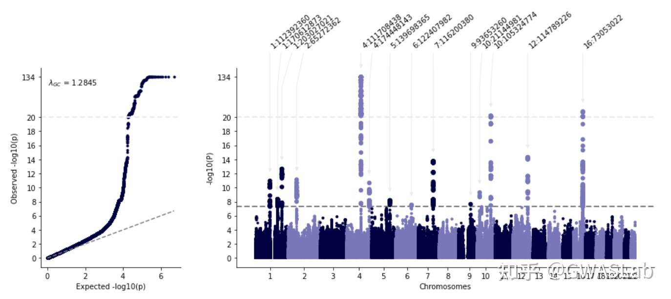
lambda gc 自动计算并注释, qq plot与manhattan plot的y轴对应,,看着是舒服一点了,
可是突出的那个loci太高,其他的loci都快看不见了,有点不协调啊,显著的loci也没有注释,怎么办?
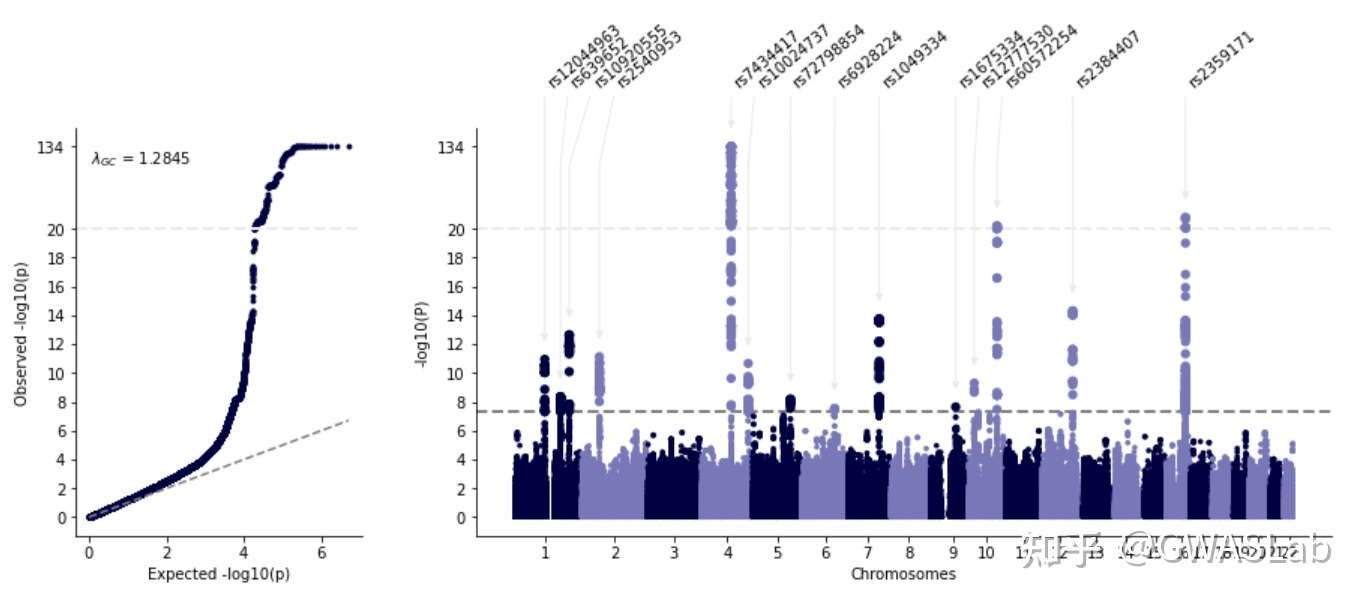
那么加几个option好了:
1.用cut 截断一下,cut以上的轴按cutfactor成比例缩小,这样就能在不丢失信息的情况下看清所有显著的loci
2.anno选项是用来自动注释lead snp的,默认基于一个500kb的滑动窗口,可以通过windowsize改变
gl.mqqplot(insumstats,"CHR","POS","PVALUE",cut=20,cutfactor=20,anno=True)

#log
Basic settings:
  - Genome-wide significance level is set to 5e-08 ...
  - Raw input contains 5018048 variants...
Start conversion and QC:
  - P values are being converted to -log10(P)...
  - Sanity check: 0 variants with P value outside of (0,1] will be removed...
  - Sanity check: 0 na/inf/-inf variants will be removed...
  - Maximum -log10(P) values is 134.014573525917 .
  - Minus log10(P) values above 20 will be shrunk with a shrinkage factor of 20...
Plotting 5018048 variants:
  - Found 14 significant variants with a sliding window size of 500 kb...
  - Annotating using column CHR:POS...
  - Created Manhattan plot successfully!
  - Created QQ plot successfully!
嗯嗯,看着舒服多了,
如果 只指定anno=True, 那么注释就只是chr: pos,当然也可以指定用于注释的列名,这里用SNP这一列注释:
gl.mqqplot(insumstats,"CHR","POS","PVALUE",cut=20,cutfactor=20,anno="SNP")
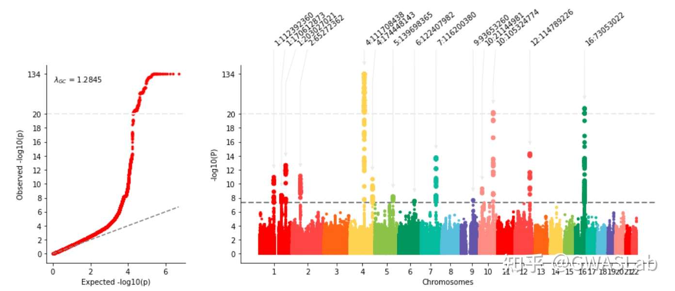
颜色不好看怎么办:
用colors选项,传个颜色的list进去,给图换个颜色,
qqplot的颜色,为了保持视觉统一,设定为曼哈顿图chr1的颜色,
例如传个彩虹进去:
myplot = gl.mqqplot(insumstats,"CHR","POS","PVALUE",
                    cut=20,cutfactor=20,anno=True,
                    colors=["#ff0000","#fc4444","#fc6404","#fcd444","#8cc43c","#029658","#1abc9c","#5bc0de","#6454ac","#fc8c84"])
其他可以选的 option
加title,调大小,什么的,目前还没有优化,后续会精简一下
mqqplot(insumstats,
          chrom,
          pos,
          p,
          scaled=False,
          cut=0,
          cutfactor=10,
          cut_line_color="#ebebeb",
          windowsizekb=500,
          anno=None,
          sig_level=5e-8,
          sig_line_color="grey",
          suggestive_sig_level=5e-6,
          title =None,
          mtitle=None,
          qtitle=None,
          figsize =(15,5),
          fontsize = 10,
          colors = ["#000042", "#7878BA"],
          layout="qqm",
          verbose=True,
          repel_force=0.03,
          gc=True,
          save=None,
          saveargs={"dpi":300,"facecolor":"white"}
          )
保存的话 save=“./yourpath/myplot.png” ,或者save=True就行
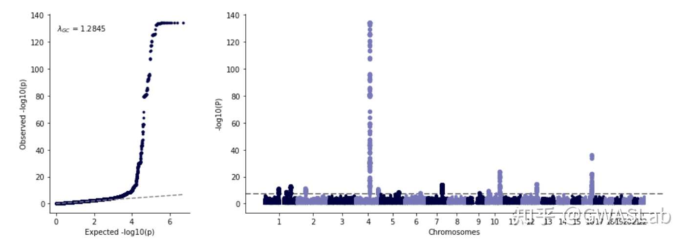
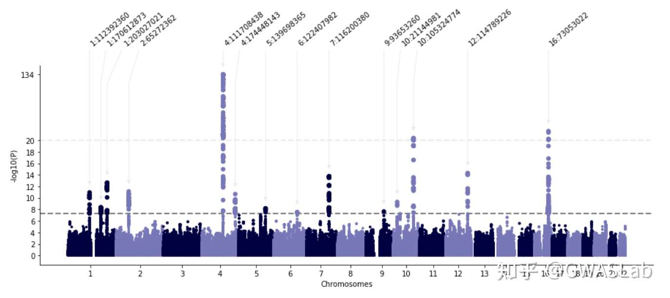
分别画Manhattan plot 与 QQ plot
当然也可以分开画 mplot
mymplot = gl.mplot(insumstats,"CHR","POS","PVALUE",cut=20,cutfactor=10,anno=True)
qqplot